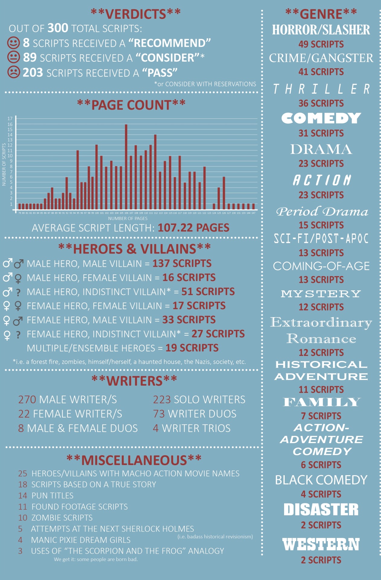
I've covered 300 spec scripts for 5 different companies and assembled my findings into a snazzy infographic (LINK)It's a beautiful and informative graphic. It's also over 7k px wide. A few versions have been cut and reposted, here's one (also linked on the tab above). Here's an example:
It's beautifully done and the thread at Reddit turned into a mini-AMA. (Ask Me Anything.)
But this graphic was also noticed by John August at Scriptnotes (johnaugust.com) in this Let's Talk about Coverage episode of the series of podcasts he does with Craig Mazin.
There is a transcript of it here.
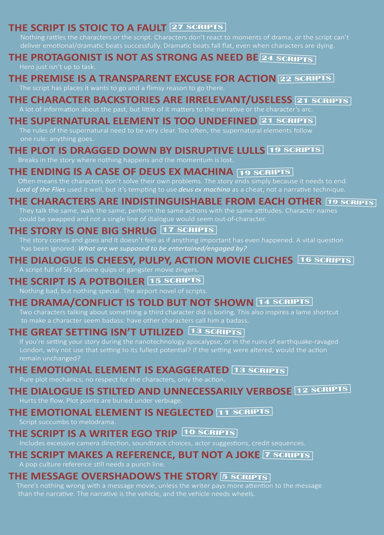
The graphic is discussed at length. Things start to get a bit shirty when they cover the sections on what's wrong with the scripts that are given a PASS.
I think the graphic creates a wonderful checklist for scripts. If I am failing at even one of these elements, why would I expect to be amongst the 2% of scripts that are recommended?
Good enough, really isn't.


I see the Blacklist finally got on board: http://gointothestory.blcklst.com/2013/12/all-the-things-that-are-wrong-with-your-screenplay-in-one-handy-infographic.html
ReplyDelete